The Importance of paper

08-29 August Bales

Watercolour paper comes in different qualities such as the weight and texture. Weight is usually given in pounds per ream or grams per square metre such as 140lb/300gsm, and the textures are Hot Pressed (HP), a smooth surface, Cold Pressed (CP or sometimes NOT)  which has a slightly textured surface, or ROUGH with a more prominent textured surface.

For the serious painter, equally important is whether the paper is 100% Rag/Cotton or a wood-free bleached chemical pulp. They may both be acid free and archival, but I would suggest they have a different feel to them when painting and may behave in a different manner.

When we start painting in watercolour, we often feel it is not worth spending a lot of money on materials when we don’t really understand what we are doing – much better to wait until we get the hang of it and then decide whether to upgrade or not.

Unfortunately, it doesn’t really work like that, and it can take a lifetime to start to ‘get the hang of it’. However it is a sound idea to use the best materials you can afford to produce the best you can achieve for the level at which you are working.

When you first start it is only natural to follow the advice of the ‘How To…’ books or your tutor, and often they will suggest a good all round middle-of-the-road not too expensive paper, which is fine. But how do you know if this paper will help you to achieve your best work if you never try another one?

Although there may only be three main surfaces of paper, they are not all consistent across all manufacturers. This is not surprising as papers are made in the UK, France, Italy, Germany and the US to name a few, and each mill will have their own recipes often arrived at after centuries of experience while at the same time complying with various environmental standards.

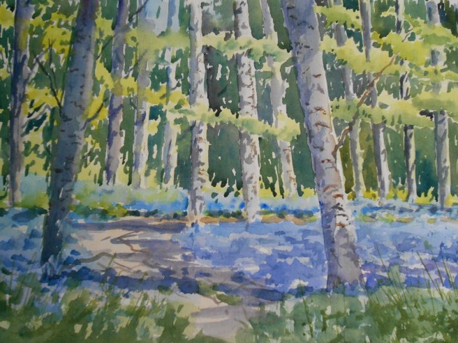
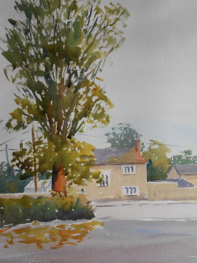
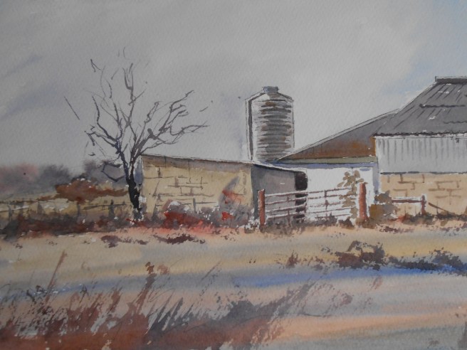
Every artist will have their favourite (which may change over time as the artist becomes more knowledgeable, changes working methods or because the manufacturing changes slightly or even because a certain paper is no longer available).

Try and overcome your fear of the new, or if you are feeling you are not making quite the progress you feel you should be, why not try investing in a sheet of a different paper?

A 22 x 30″ sheet of paper will be a lot cheaper than a pad or a block and you can cut it up into as many sizes as you want. If you like it, it may be the start of a whole new experience. If it is not for you, simply try another and compare results, or return to your original. At least then you will be painting with a better understanding of your materials and the confidence that the one you have chosen is the best suited to the style of your work.

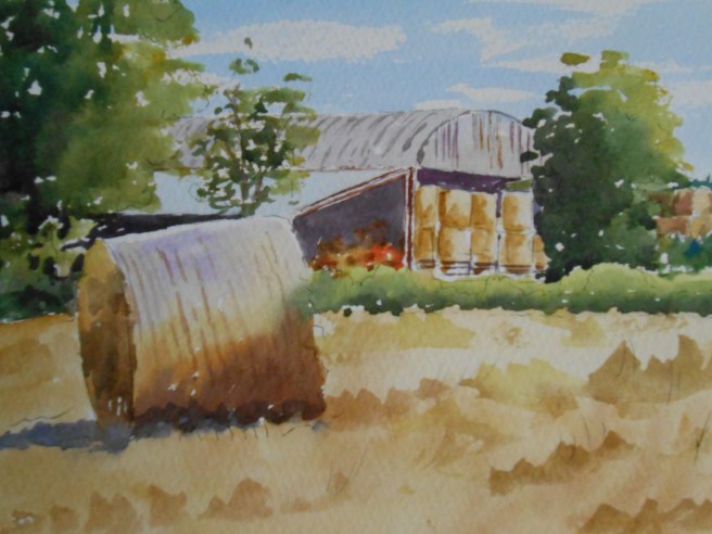
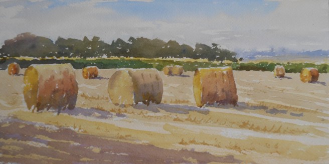
‘August Bales’ 15 x 30 cms above was painted on a piece of Arches Aquarelle 140lb CP/NOT, the last sheet on a block which I used a few years ago and which I forgot I had. I enjoyed using it for this little painting.

Ready for winter

08-15 Ready for winter

It is understandable that they moved these bales from the field pretty quickly rather than letting them become soaked by the rain. Disappointing from a painting point of view of course, not to be able to play with them for longer. At least there is the memory of them to sustain a few more small paintings like this.

6 x 8 ins watercolour on Bockingford paper

Cotswold Poppies

07-01

While there are so many poppies around, it seems a shame not to use them, even if it means moving them from the next field over for the sake of the picture…

To see them in such abundance is still unusual enough in these parts to tempt motorists to interrupt their hurry to reach wherever they are going, to pull over and take some photos. Often some will stay awhile drinking in the colour, alone with their thoughts and memories.

Poppies evoke powerful emotions.

Simplify

05-31 Morning in Baunton

Originally, although I knew it was the light on the barn I wanted to paint, I also couldn’t resist adding much more of the edge of the garden on the right hand side. When I looked at it later I realized it was just too much, taking the eye away from where I wanted it to be and leading it everywhere and nowhere.

This is another version painted whilst repeating the mantra SIMPLIFY which is what I am always telling other people to do.

I think it is good advice.

Never put off…

05-23 Path from Upper Slaughter


It was a lovely day, as all this week has been, and I thought it would be a good idea to go back to a favourite tree of mine, which I have painted in the past and is always so much fun. Old, yes. Roughly textured, certainly. But it was the crazy angle it had adopted in it’s old age which made it stand out and gave it so much character. Not only a gift for a painter but no-one with a camera or a modern phone could resist it.

Over a busy main road, along a track, through one small village, through three fields heavy with buttercups, I anticipated how it would look, which angle would I paint it from ?  I never imagined it wouldn’t be there at all ! Alas it is no more. Just a little stump, it’s majesty cut up and carted away on the back of a trailer, and not too long ago by the look of it. If only I had gone last week.

I walked on a little further and looked back. If the day was not to be wasted, I had to paint something even if it wasn’t what I had intended.

The woods are alive

The weather always likes to keep us guessing, but now I know Spring is here as the bluebells have come up in the woods, giving me the chance to paint one of my favourite annual scenes.

It may turn cold again, but it is only relative. Everywhere one looks there are signs of Nature coming back to life – and many folk re-discovering their lawnmowers !

04-29 Among the Bluebells

On guard

10-08 The sentry tree

This tree stands guard at the entrance/exit to the car park and filling station. Seen from the road you don’t really take it is as you are usually too busy keeping your eyes on the traffic which can be hectic at times. However, seen from the car park side with the cottage behind it, I thought it would make a good painting.

Greystones 2

10-05 October barns 2

This is a different version of yesterday’s view of the farm barns. Less of what was actually there and more of how I wanted to paint it to give it more of an autumnal/wintry feel. The feeling a subject gives you is just as important to take into consideration.

This one was painted with a limited palette of Yellow Ochre, Brown Madder and French Ultramarine, which in some ways is easier than using a full colour palette as you don’t have so many decisions to make and it gives the painting a certain unity. Also it is interesting to see just what colours you can make from so few pigments.

Which version do you prefer?